Data Visualisation with ggplot2
Learning Objectives
- Build graphics layer by layer with ggplot2
- Create different types of graphics by applying geometries
- Apply additional layers to a graphic
- Visually subset graphics by applying fills and gradients
- Change the appearance of graphics using themes
- Create sub-graphics by applying facets
- Create and save basic graphics
- Use additional libraries such as
plotlyto enhance the utility of graphics.
ggplot2 is a plotting package that makes it simple to create complex plots from data in a data frame. It provides a grammar for specifying which variables to plot, how they are displayed, and general visual properties. Therefore, we only need minimal changes to our code if the underlying data change or if we decide to switch from a bar plot to a scatterplot. This helps to create publication quality plots with minimal adjustments and tweaking.
First, make sure you load all of the required libraries and datasets. There are quite a few new libraries here and we will explain them as we go.
library(tidyverse)
library(ggthemes)
library(plotly)
library(ggrepel)
library(ggpubr)
library(viridis)
library(RColorBrewer)
library(ggsci)
library(patchwork)
library(gghighlight)

#This dataset is built in to R
data(iris)
#Import from the web
surveys <- read_csv("http://bifx-core3.bio.ed.ac.uk/training/R_dplyr_and_ggplot2/data/surveys_complete.csv")
Fisher’s Iris dataset (pre-installed in R)
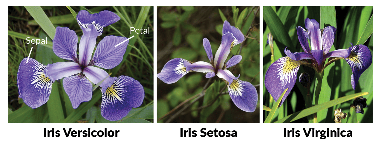
Fisher examined the length and width of the petals and sepals in irises to determine a classification algorithm. Here we will explore the relationship between species and the dimension of the flowers via the ggplot2 plotting package. Fisher’s data is stored as a built in data set in R. To see the data type:
head(iris)This data frame has two types of data, continuous and discrete.
str(iris)## 'data.frame': 150 obs. of 5 variables:
## $ Sepal.Length: num 5.1 4.9 4.7 4.6 5 5.4 4.6 5 4.4 4.9 ...
## $ Sepal.Width : num 3.5 3 3.2 3.1 3.6 3.9 3.4 3.4 2.9 3.1 ...
## $ Petal.Length: num 1.4 1.4 1.3 1.5 1.4 1.7 1.4 1.5 1.4 1.5 ...
## $ Petal.Width : num 0.2 0.2 0.2 0.2 0.2 0.4 0.3 0.2 0.2 0.1 ...
## $ Species : Factor w/ 3 levels "setosa","versicolor",..: 1 1 1 1 1 1 1 1 1 1 ...The continuous data is of type number and the discrete data is of type factor, which can be one of the 3 species:
levels(iris$Species)## [1] "setosa" "versicolor" "virginica"The summary() function gives a summary of data in a
column. For factors it will give us the count for each categorical
variable.
summary(iris$Species)## setosa versicolor virginica
## 50 50 50We can also use run summary() on an entire dataframe or
tibble. Take a look at the different column types.
summary(iris)## Sepal.Length Sepal.Width Petal.Length Petal.Width
## Min. :4.300 Min. :2.000 Min. :1.000 Min. :0.100
## 1st Qu.:5.100 1st Qu.:2.800 1st Qu.:1.600 1st Qu.:0.300
## Median :5.800 Median :3.000 Median :4.350 Median :1.300
## Mean :5.843 Mean :3.057 Mean :3.758 Mean :1.199
## 3rd Qu.:6.400 3rd Qu.:3.300 3rd Qu.:5.100 3rd Qu.:1.800
## Max. :7.900 Max. :4.400 Max. :6.900 Max. :2.500
## Species
## setosa :50
## versicolor:50
## virginica :50
##
##
## Building a ggplot
ggplot graphics are built step by step by adding new elements. Adding layers in this fashion allows for extensive flexibility and customization of plots. To build a ggplot, we use the following basic template:
ggplot(data = <DATA>, mapping = aes(<MAPPINGS>)) + <GEOM_FUNCTION>()Let’s explore the iris dataset with ggplot. Use the ggplot() function and bind the plot to a specific dataframe using the data argument.
ggplot(data = iris)
Define a mapping (using the aesthetic (aes) function), by selecting the variables to be plotted and specifying how to present them in the graph, e.g. as x/y positions or characteristics such as size, shape, color, etc.
ggplot(data = iris, mapping = aes(x = Sepal.Length, y = Sepal.Width))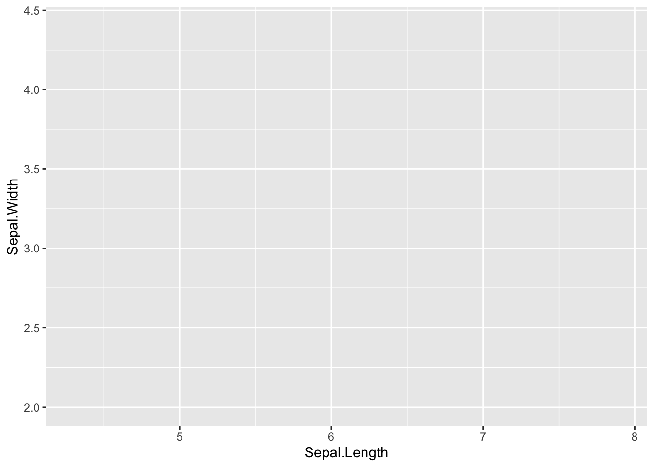
To plot our data we need to add a geometry. Geoms are the graphical representations of the data in the plot (points, lines, bars). ggplot2 offers many different geoms, here are a few commonly used examples:
geom_point()for scatter plots, dot plots, etc.geom_histogram()for histogramsgeom_bar()orgeom_col()for bar plotsgeom_boxplot()for, well, boxplots!geom_line()for trend lines, time series, etc.
Scatterplots
To add a geom to the plot use the + operator. Let’s use geom_point() to plot two continuous variables first. The data and mapping are always the first two arguments to ggplot so we can leave these out if arguments are provided in this order:
ggplot(iris,aes(x = Sepal.Length, y = Sepal.Width)) +
  geom_point()
The + in the ggplot2 package is particularly useful
because it allows us to modify existing ggplot objects. This means we
can easily set up plot templates and conveniently explore different
types of plots, so the above plot can also be generated with code like
this:
# Assign plot to a variable
p <- ggplot(data = iris, mapping = aes(x = Sepal.Length, y = Sepal.Width))

# Draw a scatter plot
p + geom_point()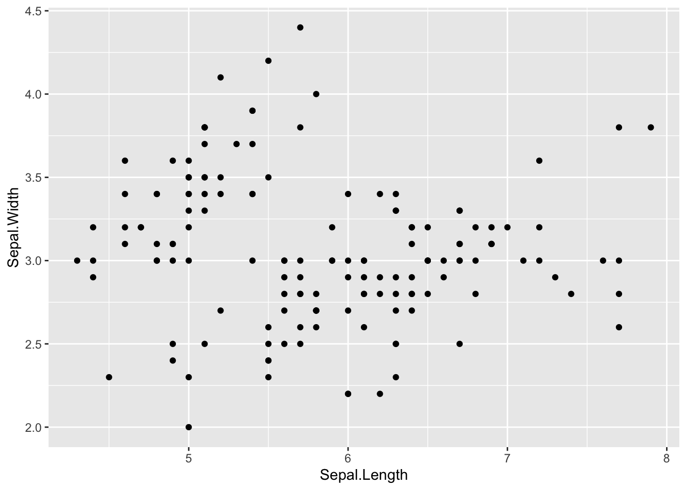
Anything you put in the ggplot() function is inherited
by the subsequent geom layers that you add. This includes the x- and
y-axis mapping you set up in aes(). If you want to specify
mappings for a given geom independently you can add these within a
geom.
We can colour the points in the geometry.
p + geom_point(colour="red")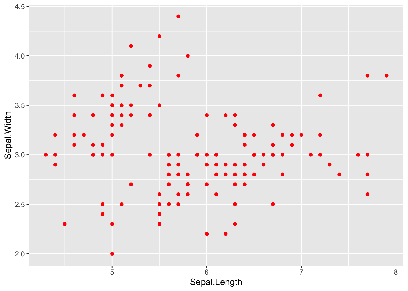
Not very informative though, let’s start again and colour the points by species. Note as well that the x and y labels are also not neccessary if the data is in the correct order.
p<-ggplot(iris, aes(Sepal.Length, Sepal.Width, colour=Species) ) +  geom_point()
p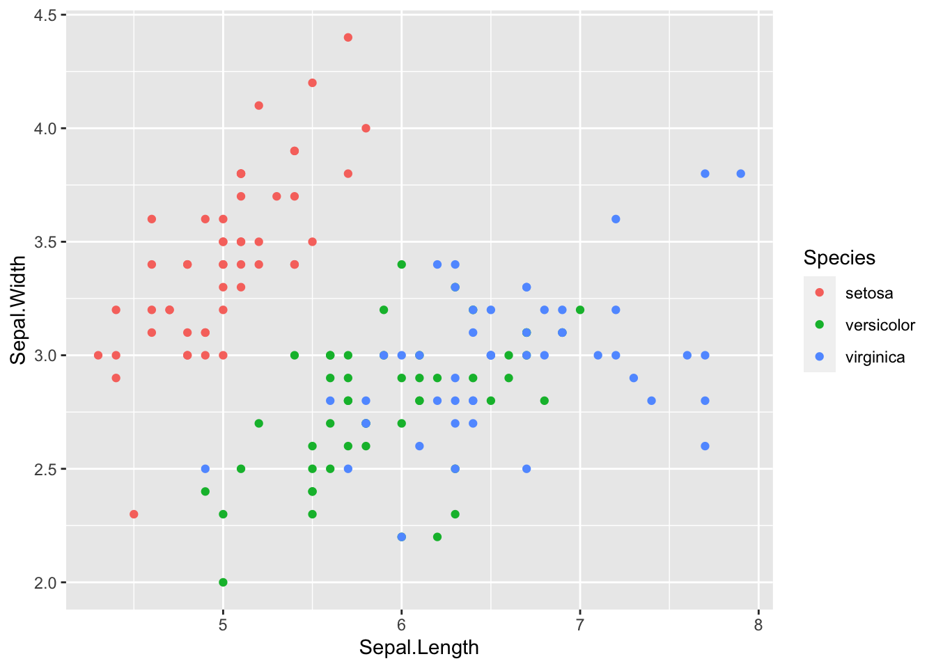
In the aes() function, colour is used for
lines and points. If you want to colour shapes such as bars in barplots
and histograms you need to use fill.
Each function within the ggplot package has its own help file associated with it.
?geom_point()Note that all the geometries also define a statistical
transformation. In the help file of geom_point you’ll see that
stat = "identity" which is just the value that is
presented. Other geometries have different defaults, for instance
geom_histogram bins values together.
Histograms
Here is an example of the histogram geometry:
#Create a new version of the iris dataset with a new column
iris2<- iris %>% mutate(Sepal.Ratio=Sepal.Length/Sepal.Width)
#Visualise the distribution of Sepal.Ratio with a histogram
h<- ggplot(iris2, aes(Sepal.Ratio, fill=Species )) +
  geom_histogram(binwidth=0.1)
h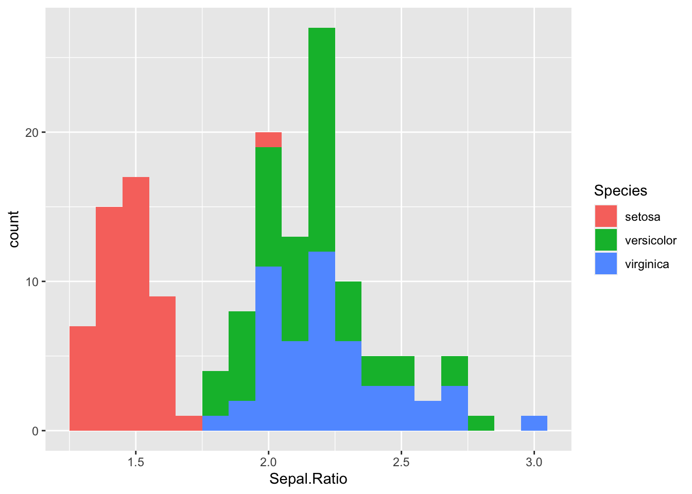
Discussion
Try altering the binwidth parameter to see how this
affects the plot.
Challenge:
Use what you have learned to create a scatterplot of Sepal.Width over Species.Solution:
ggplot(iris, aes(x=Species, y=Sepal.Width )) + geom_point() 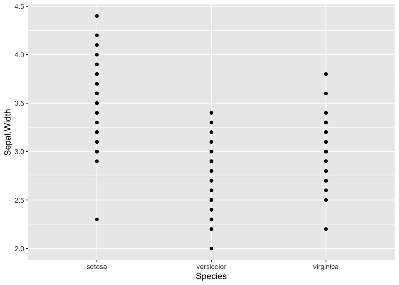
Boxplots
Boxplots are an effective way to visualise distributions of data within groups. The boxplot geometry needs the x value to be a categorical variable.
b <- ggplot(iris, aes(x=Species, y=Sepal.Width )) +  geom_boxplot()
b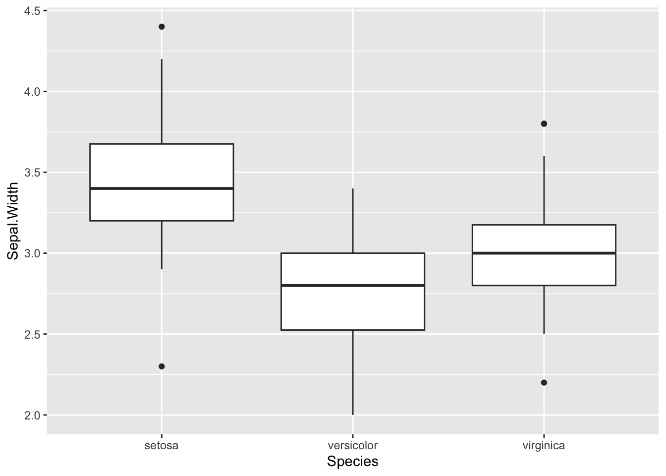
To change the axes we can use another function called coord_flip()
b + coord_flip()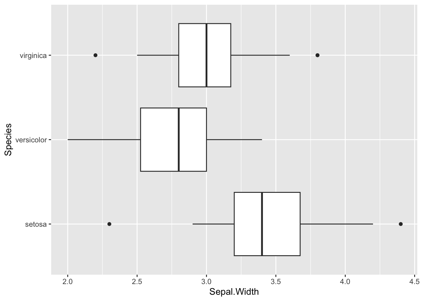
We can reorder the Species by the median
Sepal.Width for display purposes. The
forcats package in the tidyverse has
lots of functions for ordering, labelling and manipulating factors
(discrete / categorical variables).
b <- ggplot(iris, aes(x=fct_reorder(Species,Sepal.Width), y=Sepal.Width )) +
  geom_boxplot()
b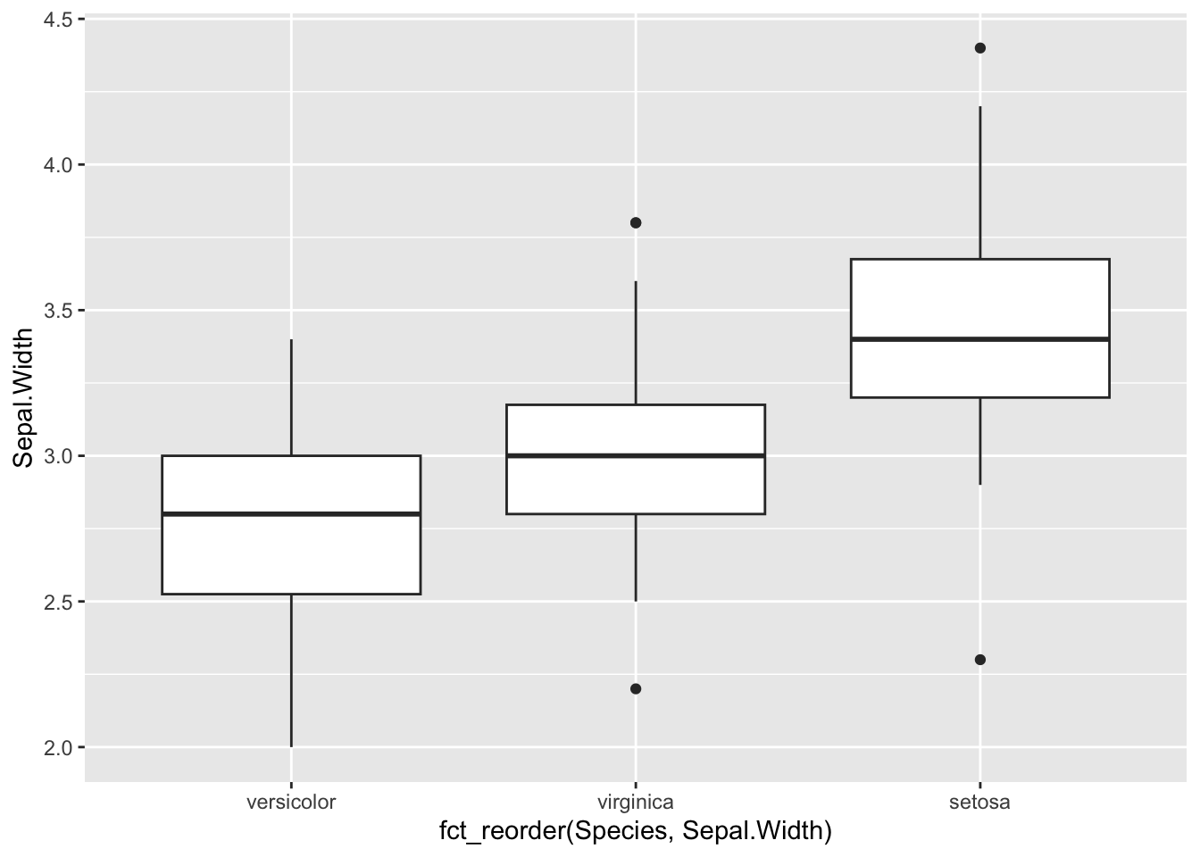
We probably want to relabel the x-axis now:
b <- b + xlab("Species")
b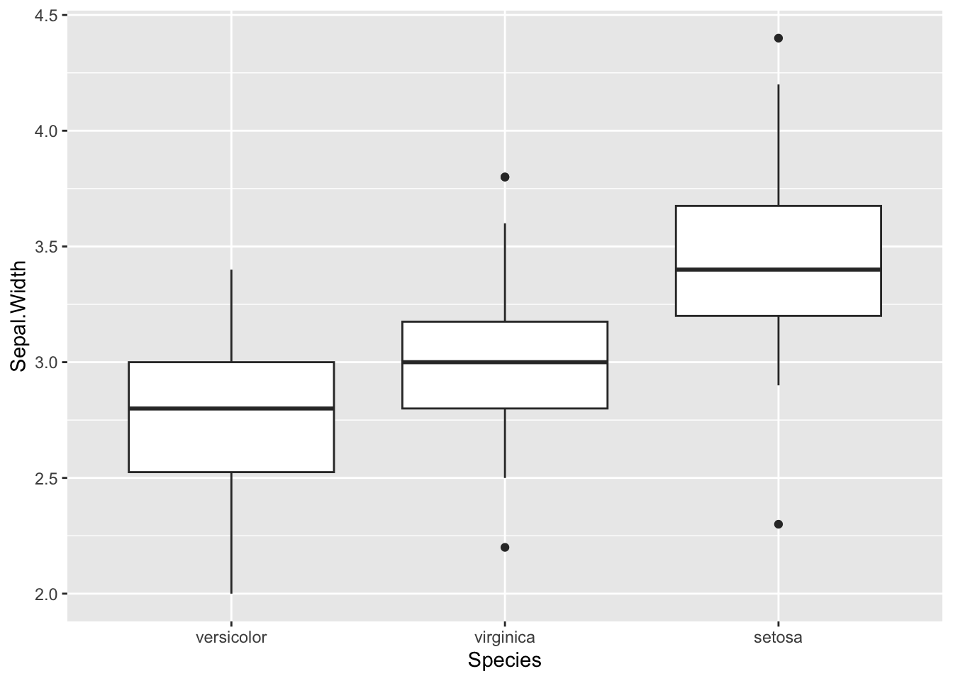
What if we want to plot all of the variables per species as a boxplot? We can add multiple boxplot geoms to a plot but it doesn’t really work as an informative graphic:
ggplot(iris) +
  geom_boxplot(aes(x=Species, y=Sepal.Length)) +
  geom_boxplot(aes(x=Species, y=Sepal.Width)) +
  geom_boxplot(aes(x=Species, y=Petal.Width)) +
  geom_boxplot(aes(x=Species, y=Petal.Length))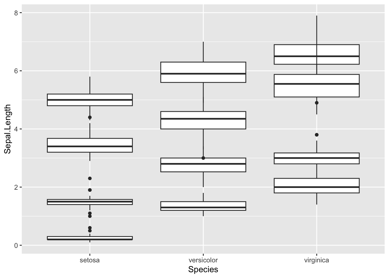
The problem is that our different variables (Sepal.Length, Sepal.Width etc.) exist in different columns. There is no way to separate these along the x-axis or to colour them differently.
Our data is currently in “wide” format and each row represents an
observation for one flower. We need to transform the data into “long”
format so that each column header becomes a value. We can use the
pivot_longer() function in tidyr to do
this.
#We use "-Species" as we want to pivot all of the columns except Species. We move the column names to a new variable called flower part and the values to a column called Value.
iris.long <- iris %>% pivot_longer(-Species, names_to = "Flower.Part", values_to = "Value")
head(iris.long)
Now it is easy to create the boxplot we wanted.
ggplot(iris.long, aes(Species, Value, fill=Flower.Part)) + geom_boxplot()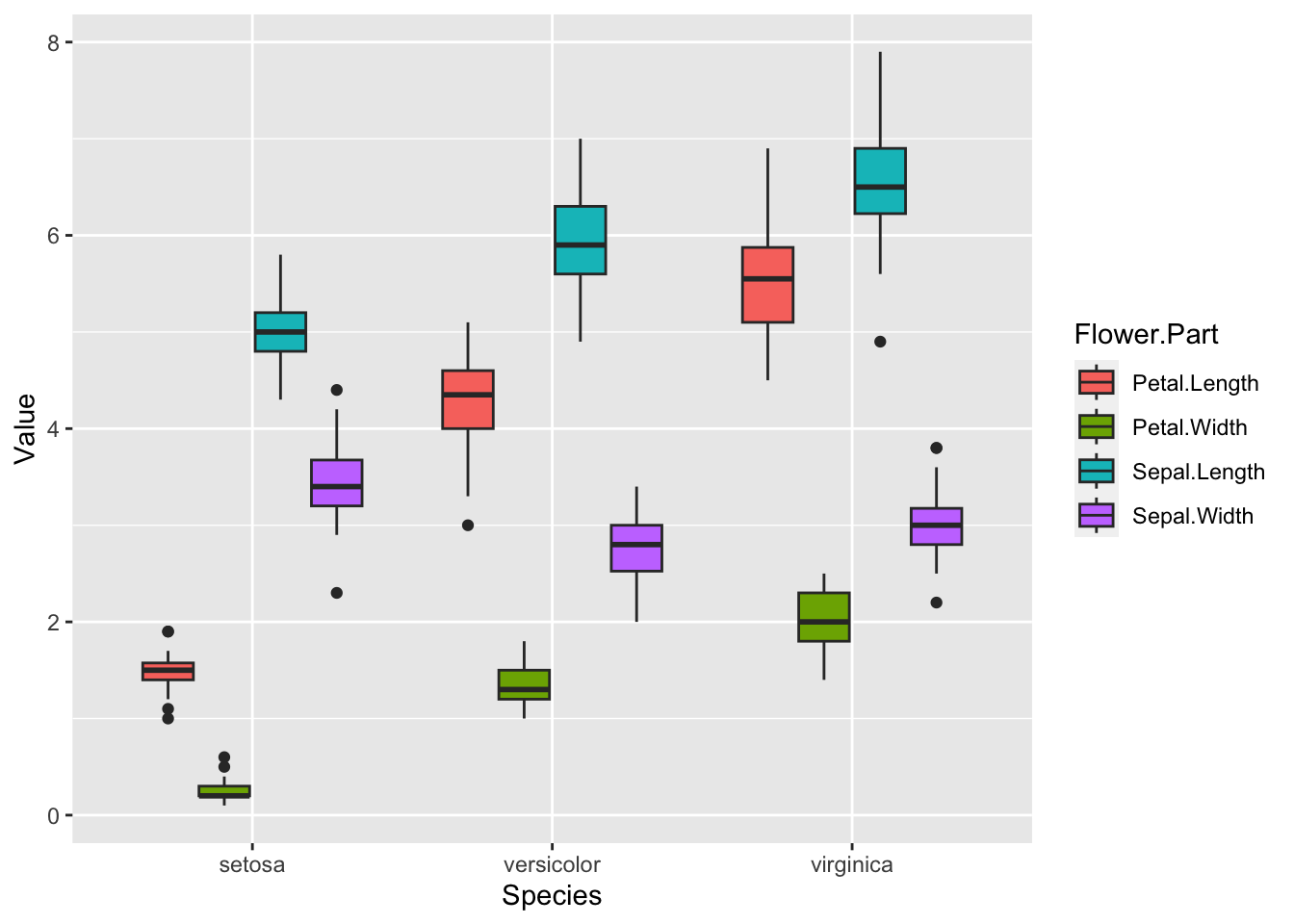
Adding layers
By adding points to a boxplot, we can have a better idea of the number of measurements and of their distribution.
b + geom_point(colour="forest green")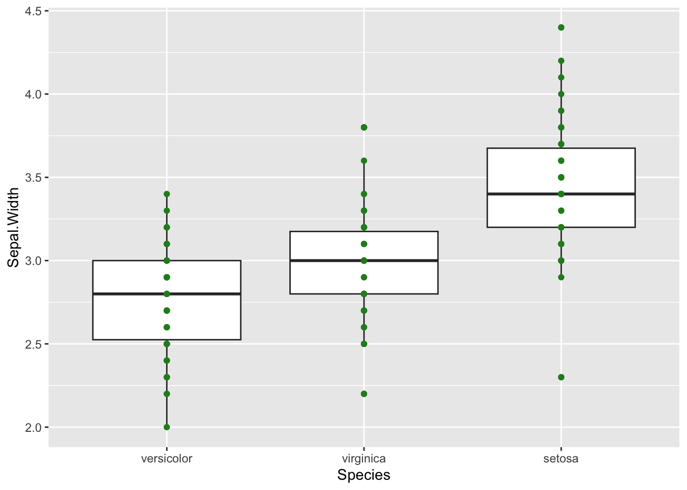
This is okay, but there are some blurry dots where values overlap and
it’s difficult to see how many data points we really have. We can use
the alpha option within our geometry to increase
transparency.
b + geom_point(colour="forest green",alpha=0.3)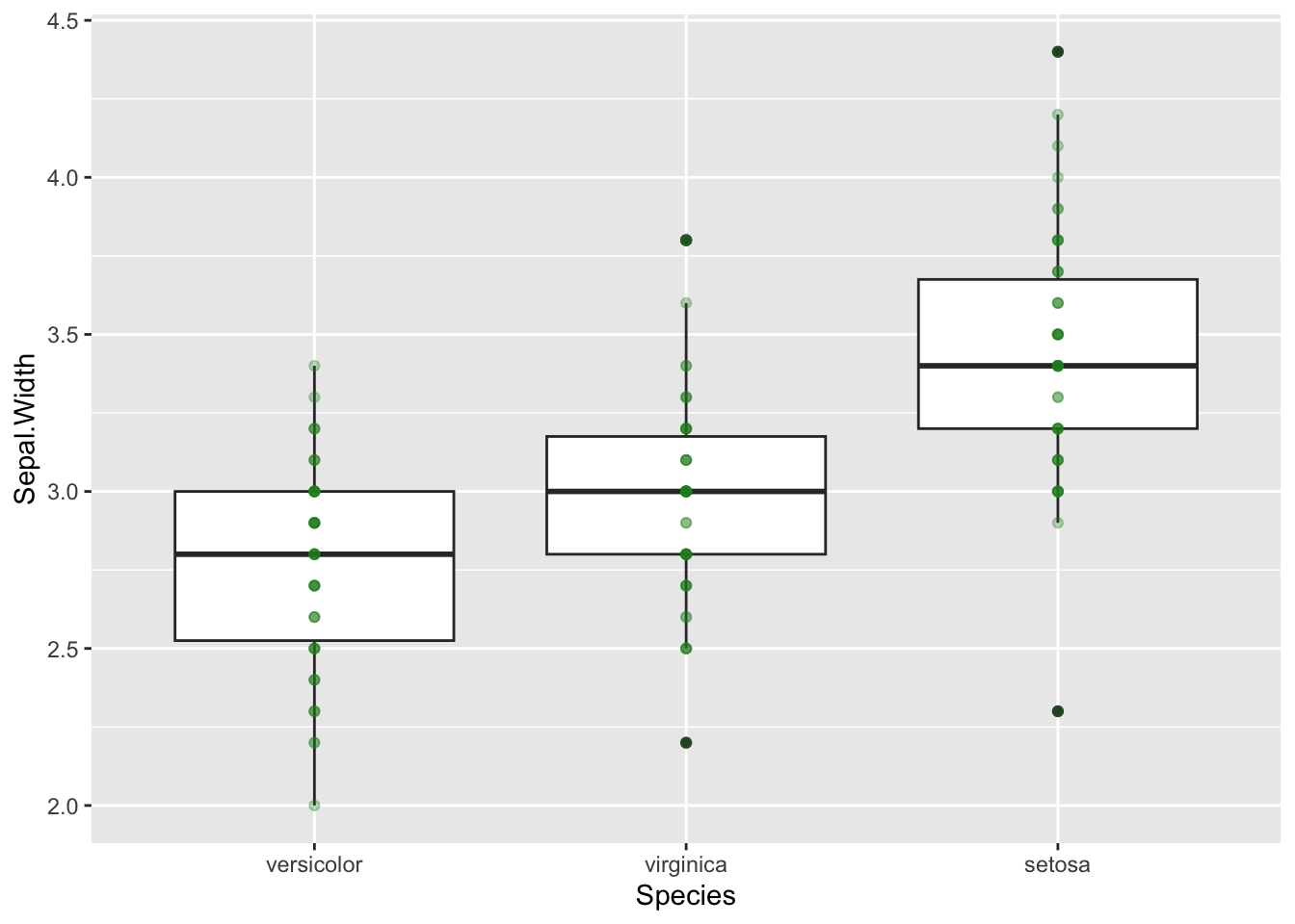
This is slightly better, we can see that darker points have more
overlap, but it isn’t great. geom_jitter is a good
alternative to geom_point in this example as it shifts data
points so that they don’t overlap. We will colour by Species so there is
no confusion.
b + geom_jitter(aes(colour=Species))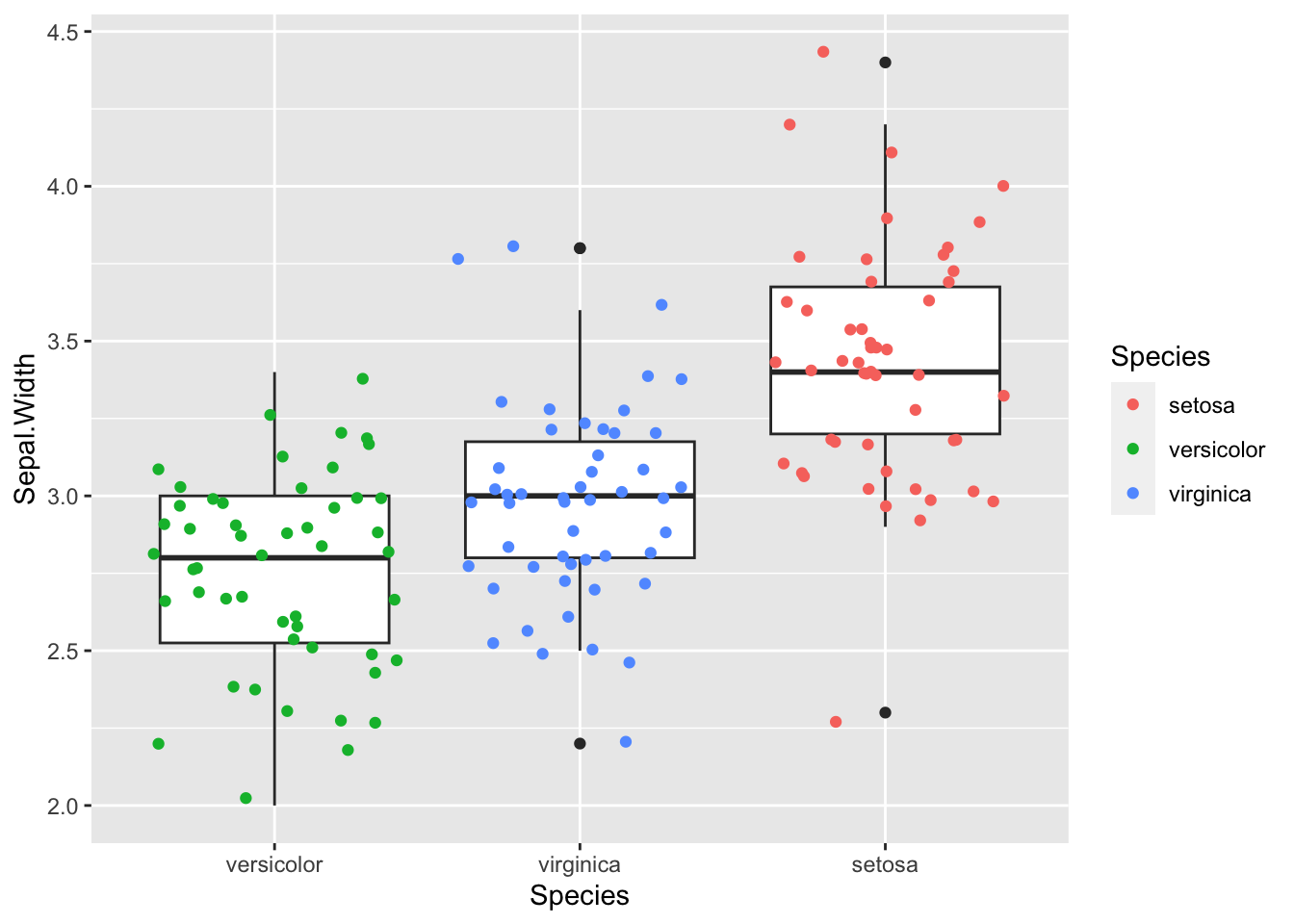
Violin plots
Challenge:
Boxplots are useful summaries, but hide the shape of the distribution. For example, if the distribution is bimodal, we would not see it in a boxplot. An alternative to the boxplot is the violin plot, where the shape of the density of points is drawn.
Replace the box plot with a violin plot; seegeom_violin().
Solution:
ggplot(iris, aes(x=fct_reorder(Species,Sepal.Width), y=Sepal.Width, fill=Species )) +
  geom_violin() +
xlab("Species") 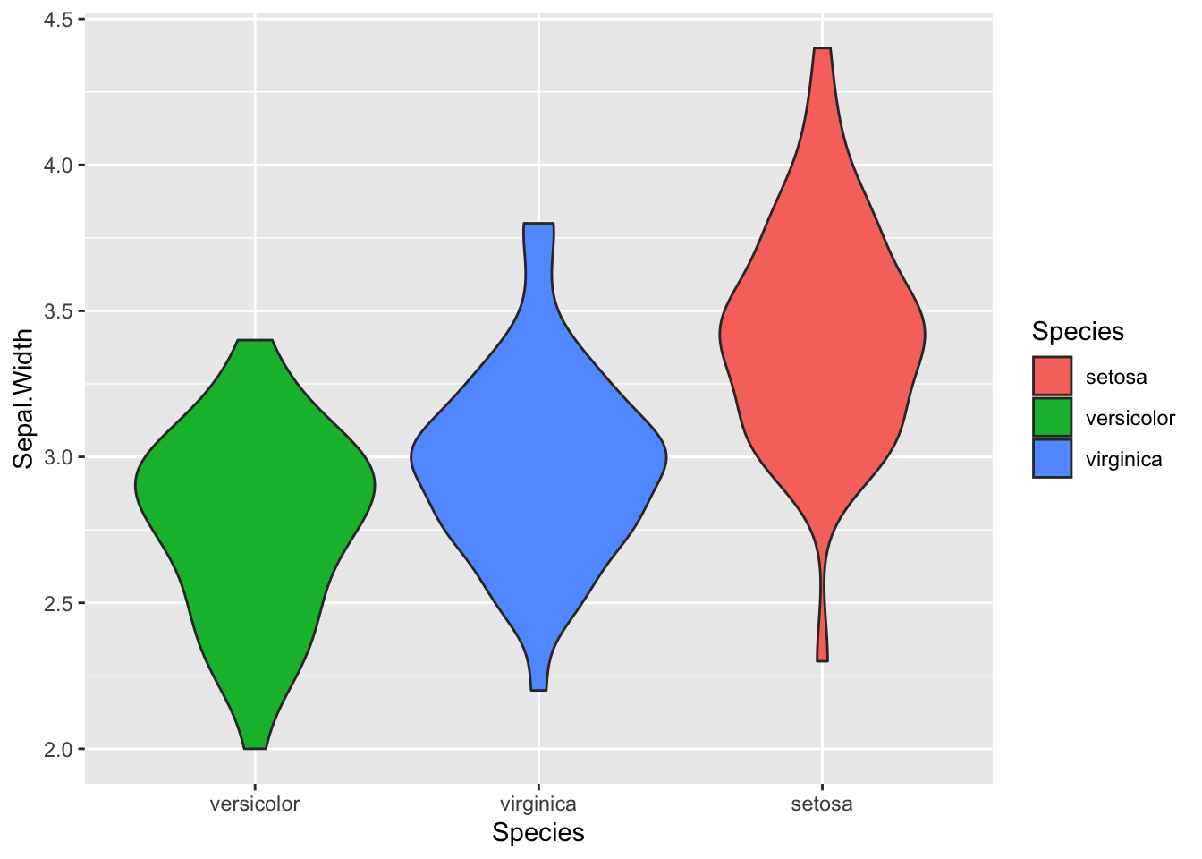
Solution:
ggplot(iris, aes(x=fct_reorder(Species,Sepal.Width), y=Sepal.Width)) +
  geom_violin(aes(fill=Species),alpha=0.3)+
  geom_boxplot()+
  geom_jitter(aes(colour=Species))+
xlab("Species") 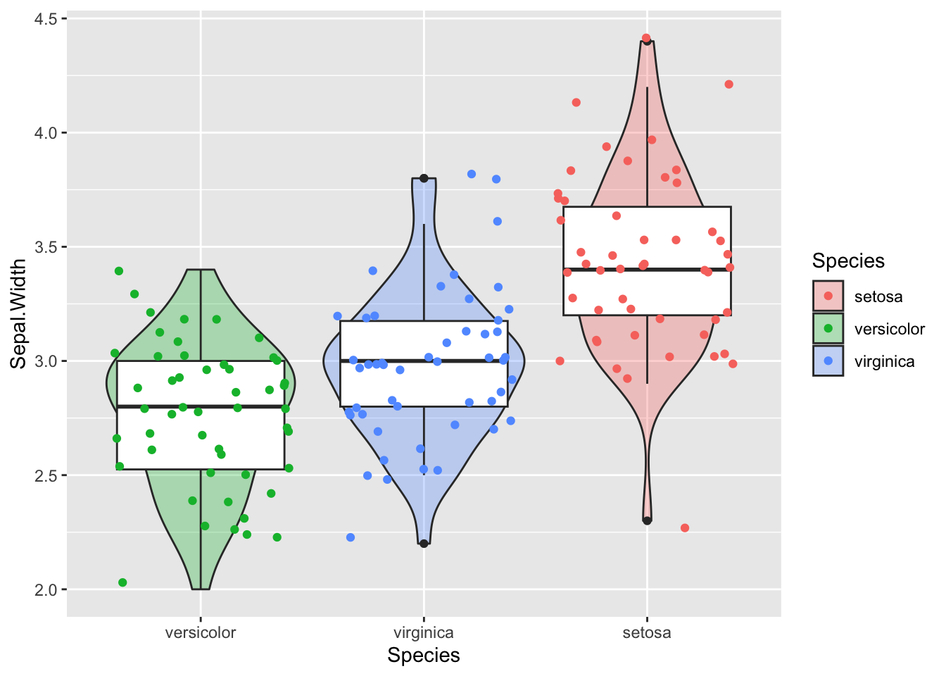
Themes
Recap:
p<-ggplot(iris, aes(x=Sepal.Length, y=Sepal.Width, colour=Species)) + geom_point()We can continue to modify this scatter plot. Let’s make the axis a bit prettier with the xlab() and ylab() functions:
p <- p + xlab("Sepal length") + ylab("Sepal width")
p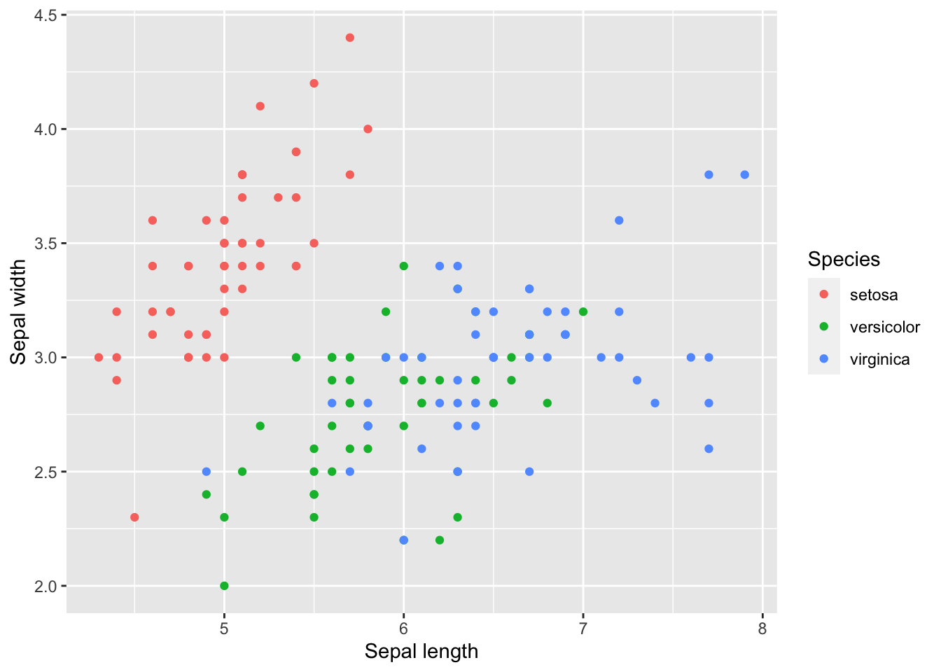
All the characteristics of the plot, such as text size and the background are managed by the function called theme(). To see what a theme can change:
?themeYou can use a theme with predefined defaults e.g:
p + theme_dark() #Dark theme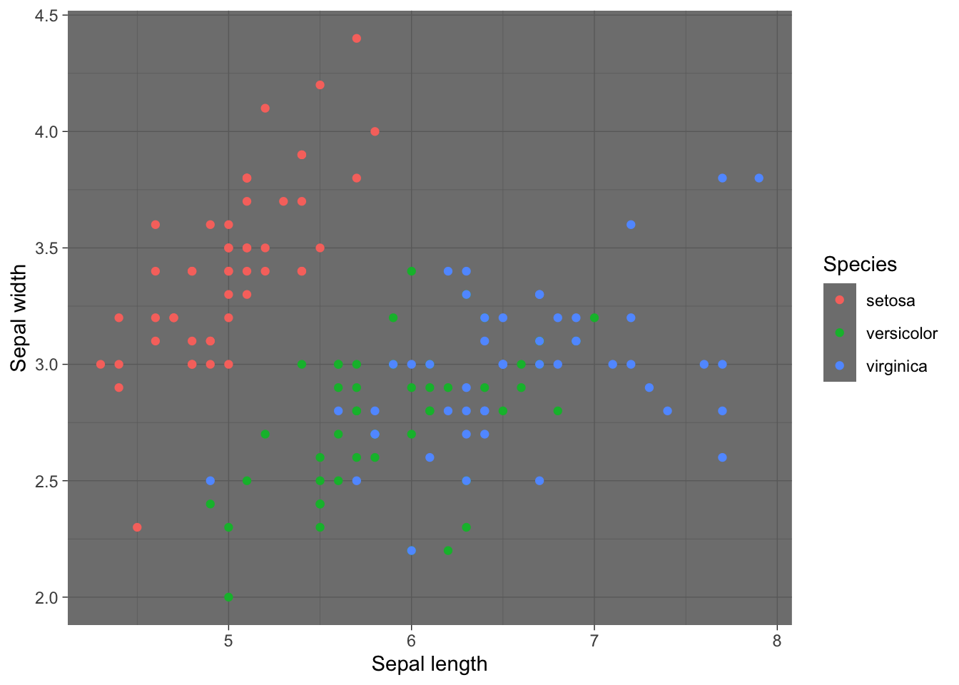
#OR
p + theme_bw() #Black and white theme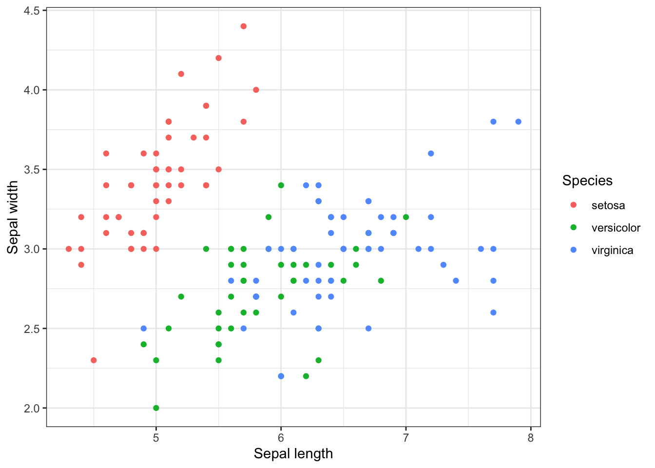
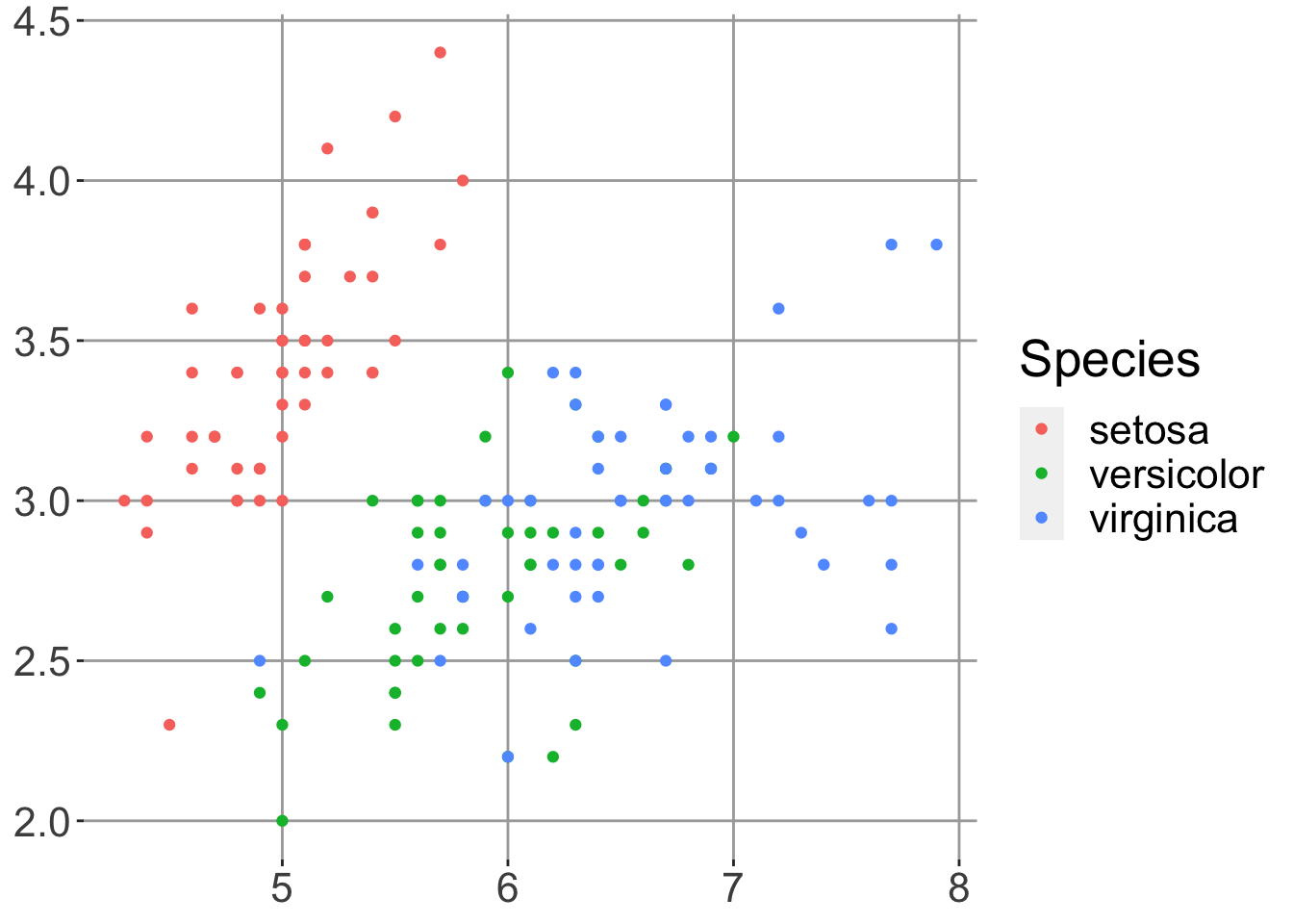
You can also try theme_light,
theme_minimal, theme_void, or create you own
from scratch:
p + theme(
            panel.background = element_blank(),
            panel.grid.major = element_line(colour = "darkgrey"),
            text = element_text(size=20),
            axis.title.x=element_blank(),
            axis.title.y=element_blank()
            )
# Note you can save your theme and reuse it
theme_for_nature <- theme(
            panel.background = element_blank(),
            panel.grid.major = element_line(colour = "darkgrey"),
            text = element_text(size=20),
            axis.title.x=element_blank(),
            axis.title.y=element_blank()
            )
We can then reuse a theme, for example on the histogram we made earlier.
h + theme_for_nature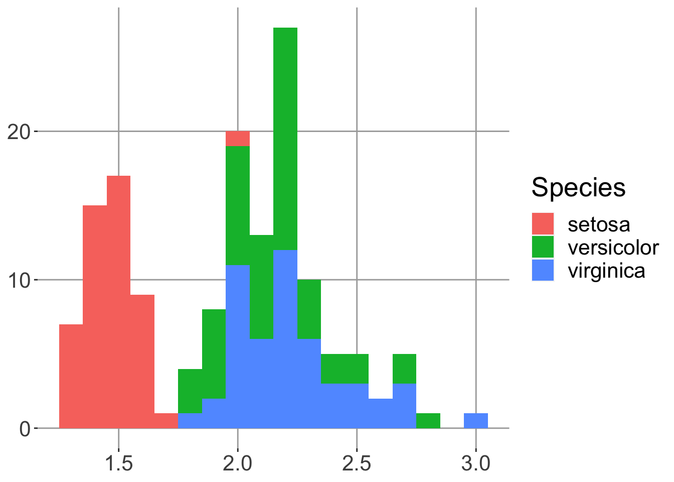
R-studio will offer help finding themes after typing “theme_”. Give some of them a try. The ggthemes and ggpubr packages also contain a selection of prebuilt themes e.g:
library(ggthemes)
p + theme_fivethirtyeight()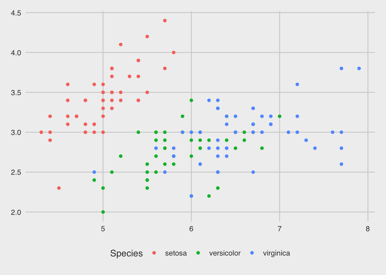
We can set a default theme to use in all ggplots:
theme_set(theme_bw())Adding colours to plots
As we have seen, points, lines and shapes can be coloured by a value
in your dataframe using the aes() function. Earlier we
coloured by a factor but we can also colour by a continuous value which
will create a gradient of colour. Lets look at the Petals this time and
colour by the ratio of Sepal.Length to Sepal.Width:
q <- ggplot(iris2, aes(x=Petal.Length, y=Petal.Width, colour=Sepal.Ratio)) +
  geom_point(alpha=0.5)
q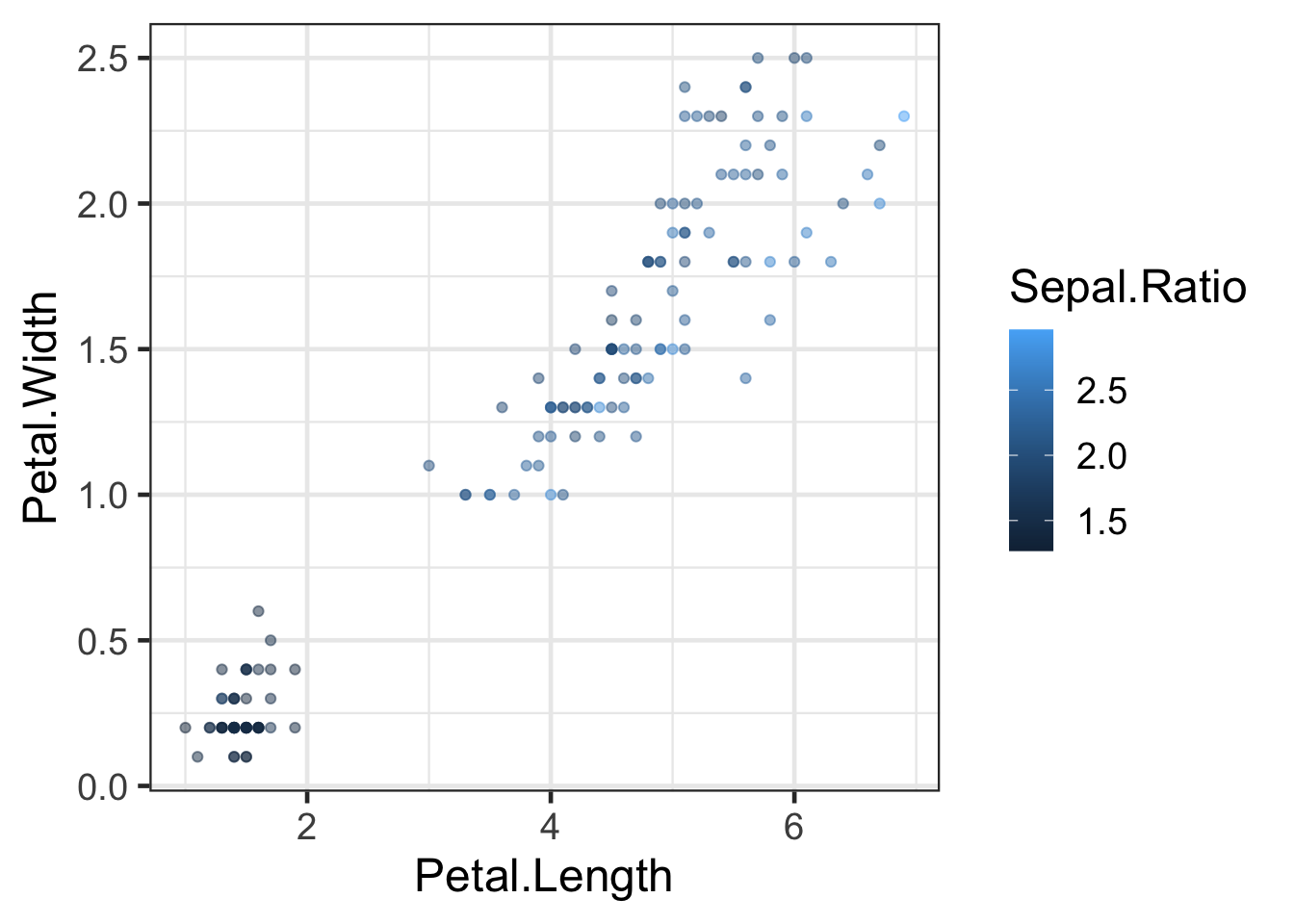
To change the colours we need to use the scale_color_*
functions of which there are many. Some are built into
ggplot2 and others exist in external packages such as
viridis or ggthemes. The viridis
and ColorBrewer
palettes are particularly useful and worth investigating. The ggsci
package contains palletes based on key scientific journals.
Continuous scales
Try the different scale options in the code below:
library(viridis)
library(RColorBrewer)
#default
q + scale_colour_continuous()
#ColorBrewer palletes (many to choose from)
q + scale_colour_distiller(palette = "Spectral")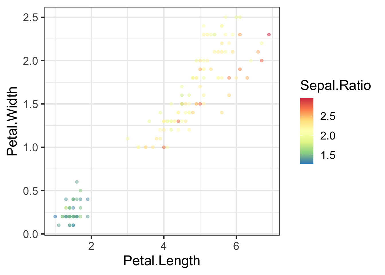
#Viridis colour scales (many to choose from)
q + scale_colour_viridis()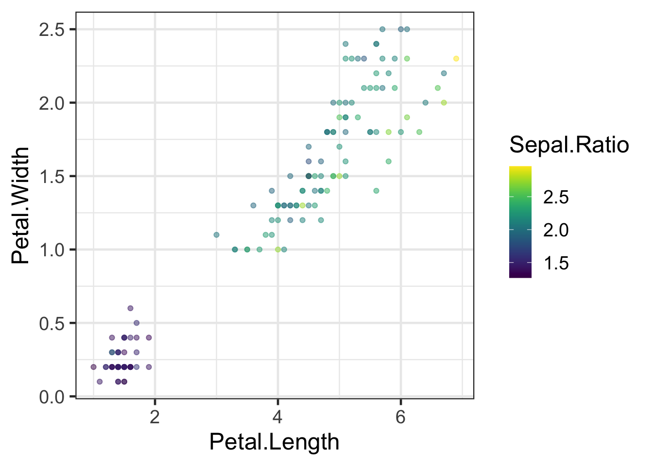
An alternative method is to use the
scale_colour_gradient* functions to define your own
gradient e.g:
q + scale_color_gradient2(high="darkred", low="white", mid="red", midpoint=2)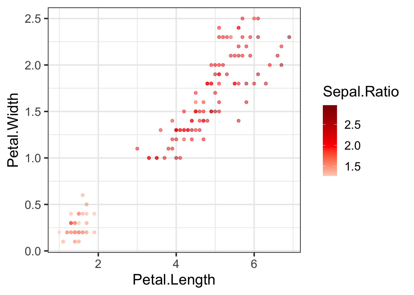
Discrete scales
There are also colour scales for discrete variables. Note that we
must use fill for colouring boxes.
bp<- ggplot(iris2,aes(Species,Sepal.Length,fill=Species)) +
  geom_boxplot()
#Default
bp + scale_fill_discrete()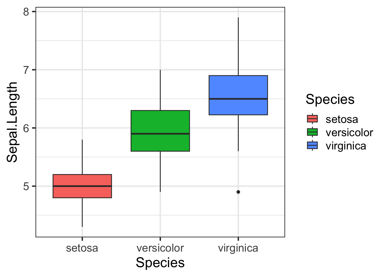
#Viridis
bp + scale_fill_viridis(discrete = TRUE)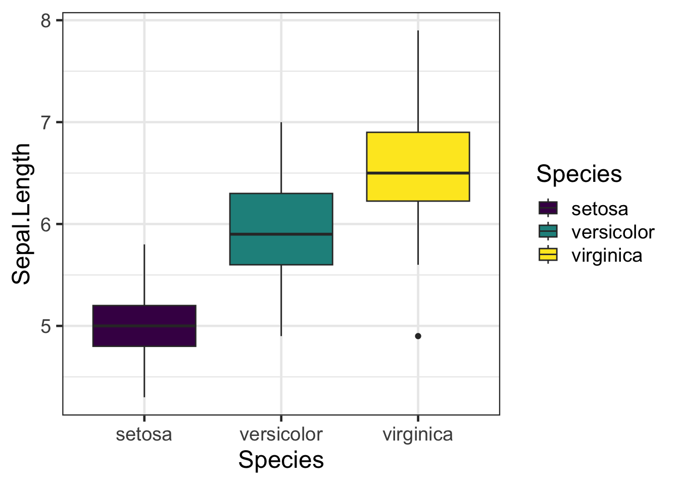
#ColorBrewer Palettes
bp + scale_fill_brewer(palette = "Dark2")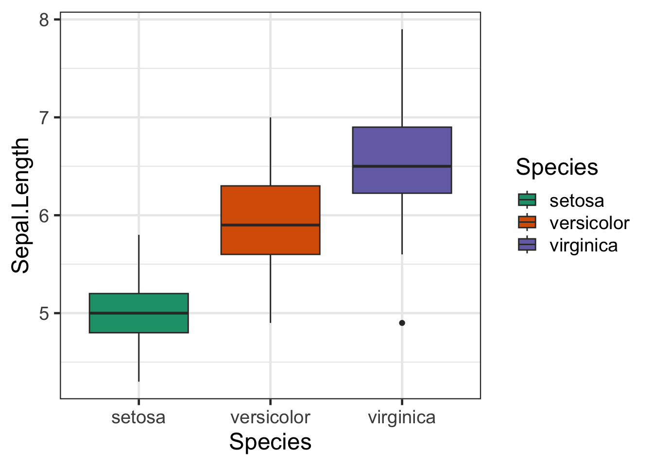
#GGSci - Nature publishing group
library(ggsci)
bp + scale_fill_npg()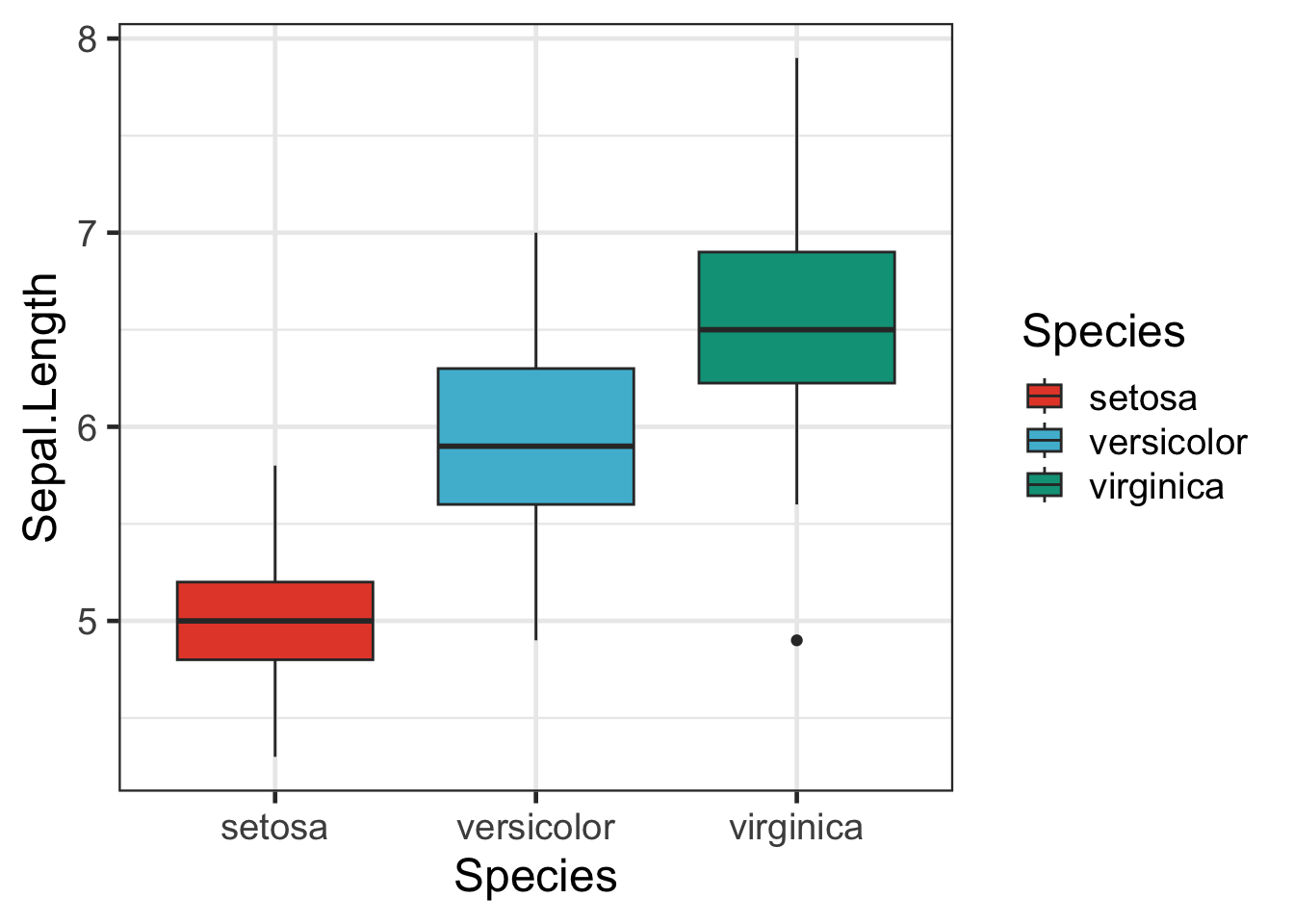
Alternatively you can manually choose your own colours:
h + scale_fill_manual(values = c("forest green","dodger blue", "firebrick"))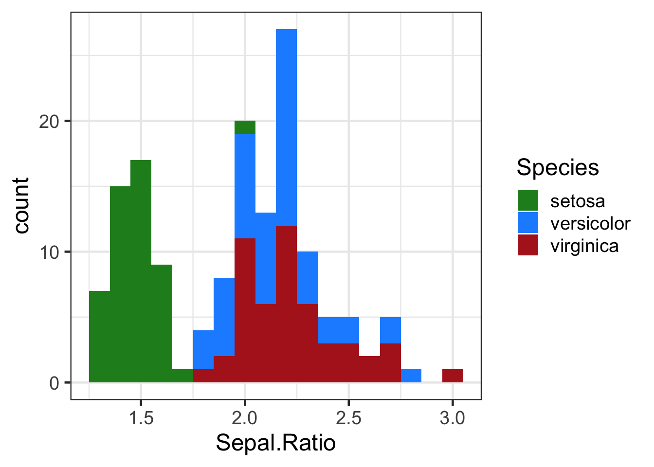
Further Learning
The options for colouring graphs are huge.
- Color brewer 2 is a great site for getting the hex values of colours to suit needs such as printer or colour blind friendliness.
- Coolors and Colormind are colour palette generators.
Adding more variables
Take a look at this example:
ggplot(iris2, aes(x=Petal.Length, y=Petal.Width, colour=Sepal.Ratio)) +
  geom_point()
Challenge:
See if you can represent some of the other variables from the iris dataset in this plot as well. Hint: There are several other aesthetic mappings such assize and
shape.
Solution:
ggplot(iris2, aes(x=Petal.Length, y=Petal.Width, colour=Sepal.Ratio, shape=Species,size=Sepal.Length)) +
  geom_point(alpha=0.5)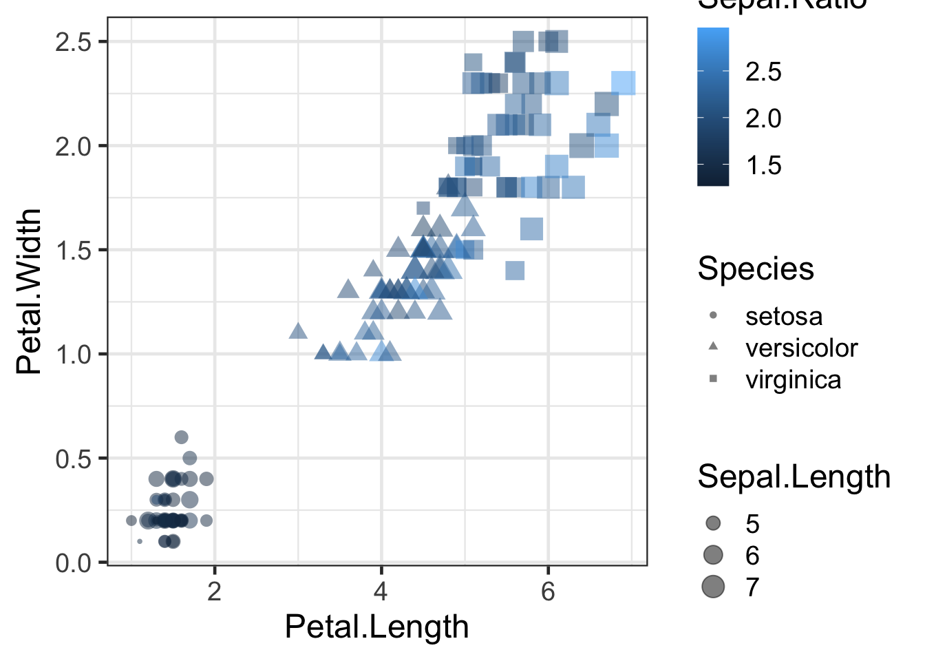
Faceting
When we have defined groups within a dataset, we can split our data
into separate plots by using facets.
Let’s look at plot q again
q
Let’s split this plot by species. This is achieved using either the
facet_grid() or facet_wrap() functions:
q + facet_wrap(~Species,nrow = 1,scales = "fixed")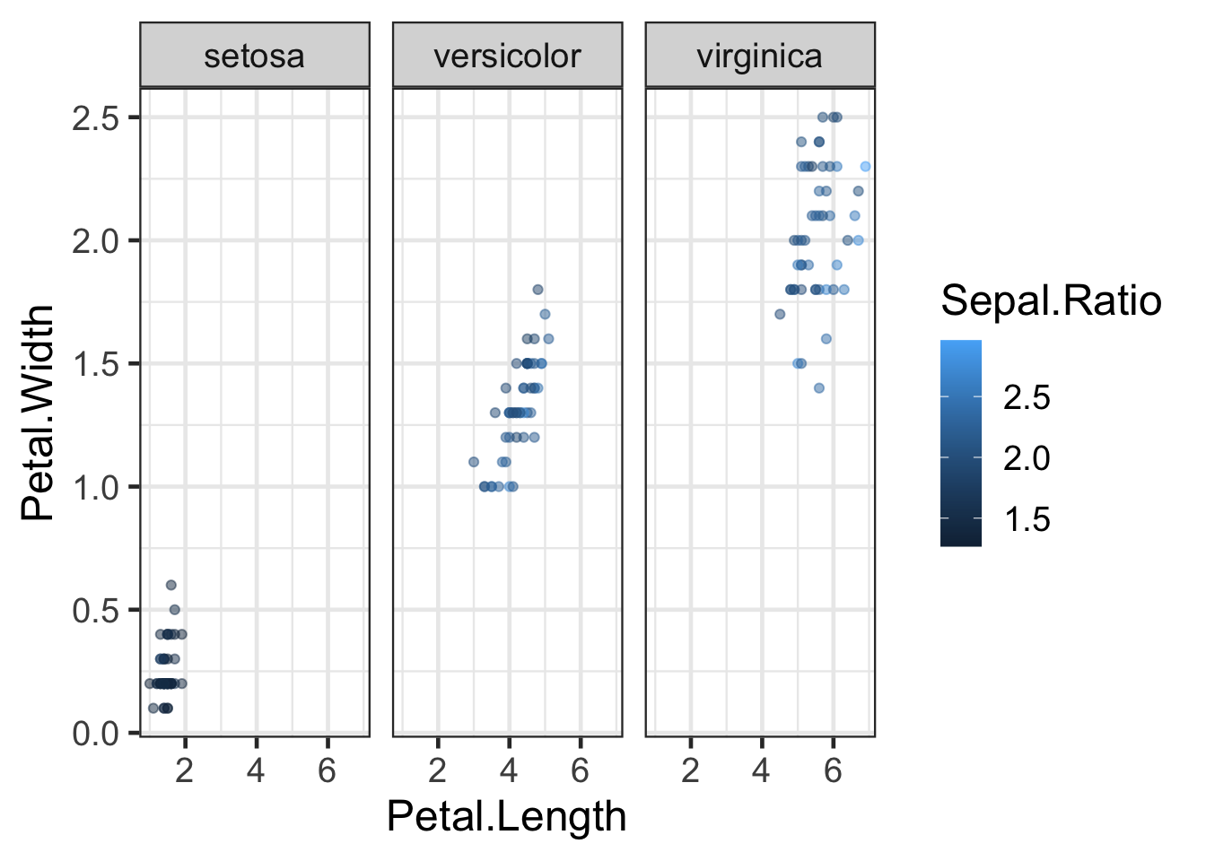
Note that the facet variable is preceded by the ~ character. This is
used to define formulas in R. Try playing around with the
nrow and scales parameters in
facet_wrap().
The facet_grid() function is useful when you are
splitting by multiple factors. For instance, let’s add a country column
to iris2 by randomly assigning one of four nations of
origin to each observation:
countries <- c("Italy", "Spain", "France", "UK")
#Sample will randomly select a value for each row
iris2 <- iris2 %>% mutate(Country=sample(countries,nrow(iris2),replace=TRUE))

q2 <- ggplot(iris2, aes(x = Petal.Length, y = Petal.Width, colour = Sepal.Ratio)) +
  geom_point()
q2 + facet_grid(Country ~ Species)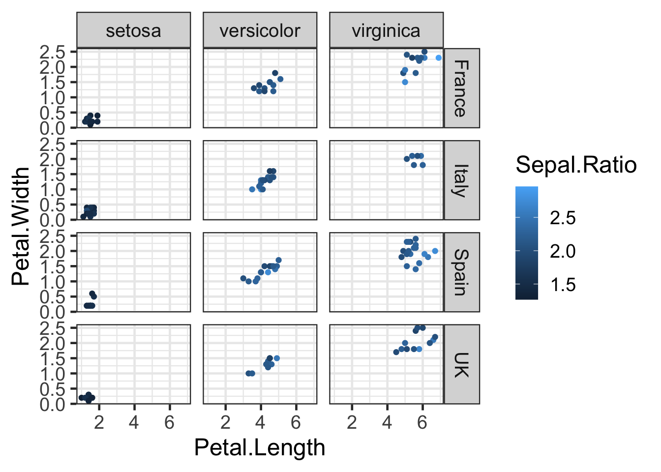
Challenge:
Use dplyr and ggplot to display the mean petal length for each species in each country except for those found in France. Use colouring and faceting to enhance the plot.Solution:
iris2 %>%
filter(Country != "France") %>%
group_by(Species,Country) %>%
summarise(Mean=mean(Petal.Length)) %>%
ggplot(aes(x=Country, y=Mean, colour=Species)) + geom_point(size=4) + facet_wrap(~Species) + labs(title="Mean Petal Length")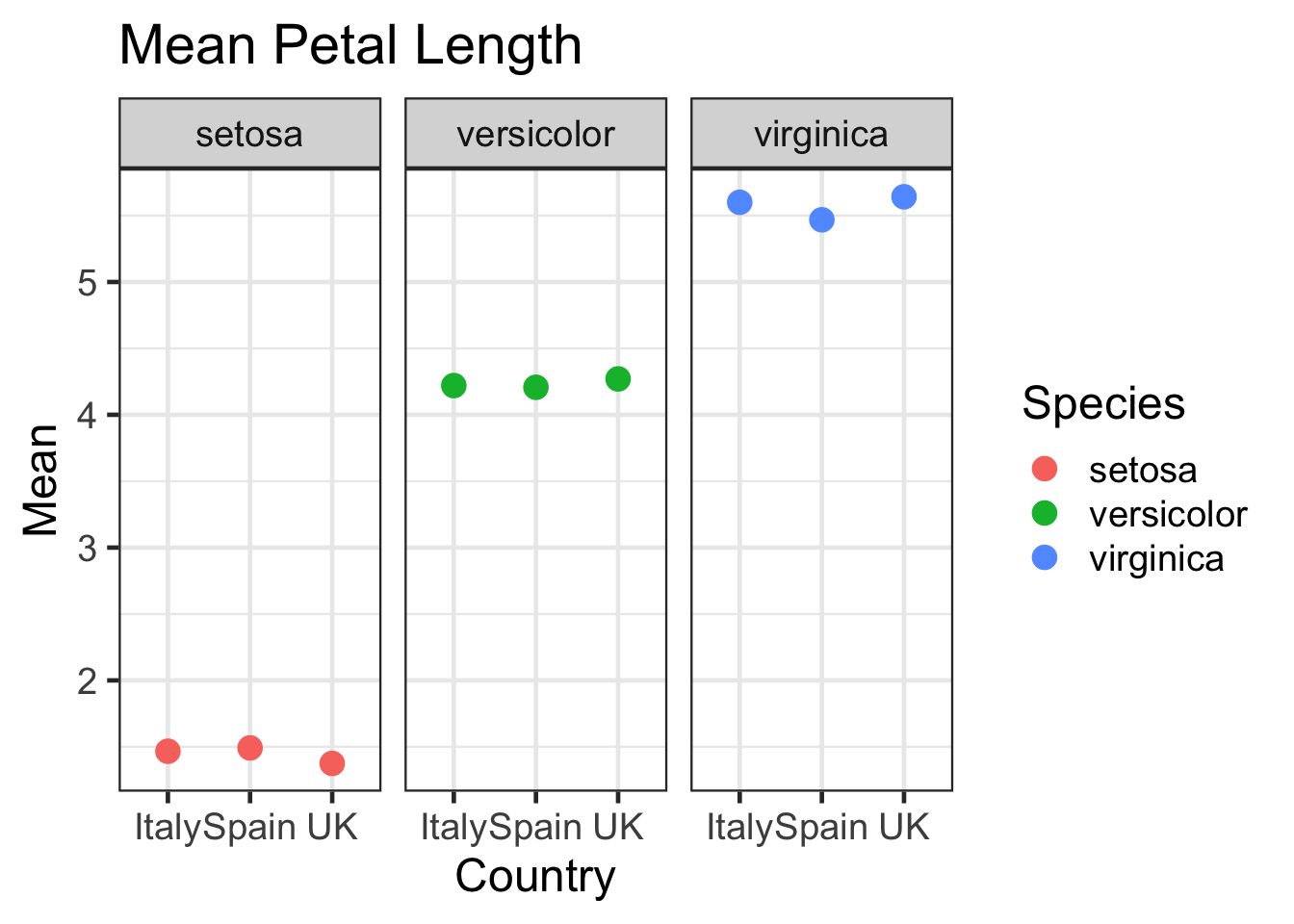
Saving plots
In RStudio there are many options to save the image. However, if you
are are wanting to use ggplot2 in a script, or via web interfaces, you
can export a graph using the function ggsave().
#save a png file
ggsave("IrisScatterplot.png", p)
#save a pdf file
ggsave("IrisScatterplot.pdf", p)
The image format is automatically assigned from the file extension
you use in the filename. Within ggsave() you can also set
the resolution for the image as well as the length and width for the
image. See the help page for ggsave for more options.
Arranging multiple plots
Placing ggplots side by side can be performed with packages like gridExtra and patchwork. Patchwork uses simple formulas to arrange ggplots:
library(patchwork)
#On top
q/bp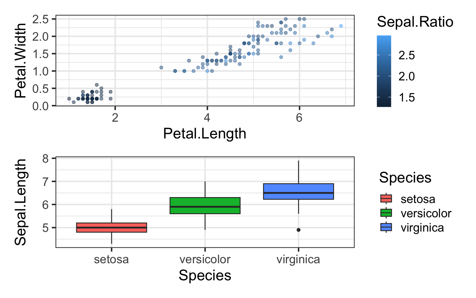
#Side by side
q+bp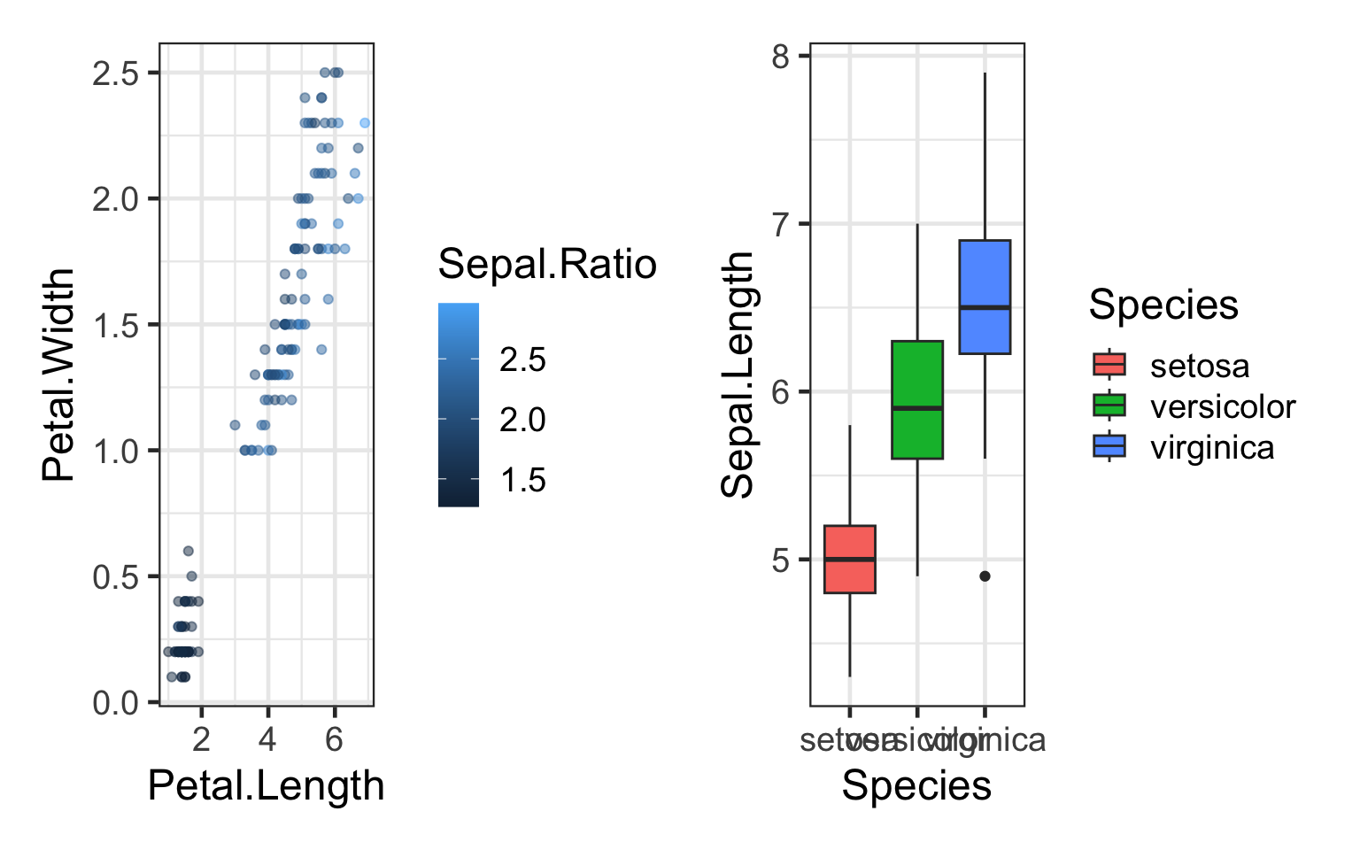
#2 plots on top, 1 on bottom
(q+h)/bp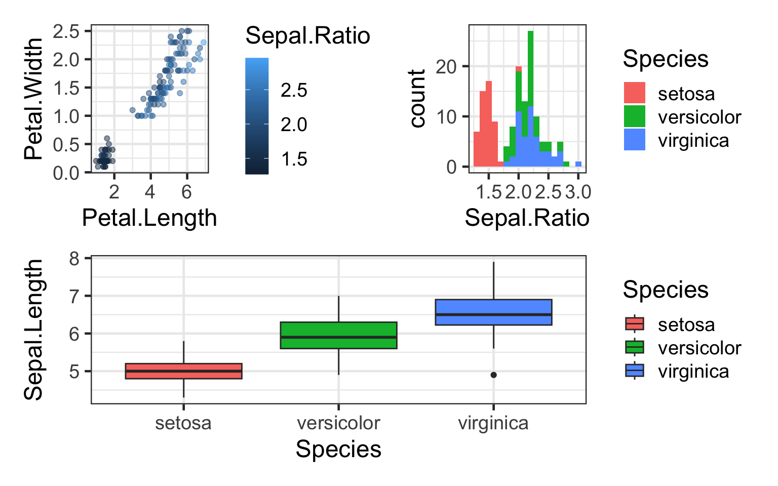
#Collect the guides together on one side
(q+h)/bp + plot_layout(guides = "collect")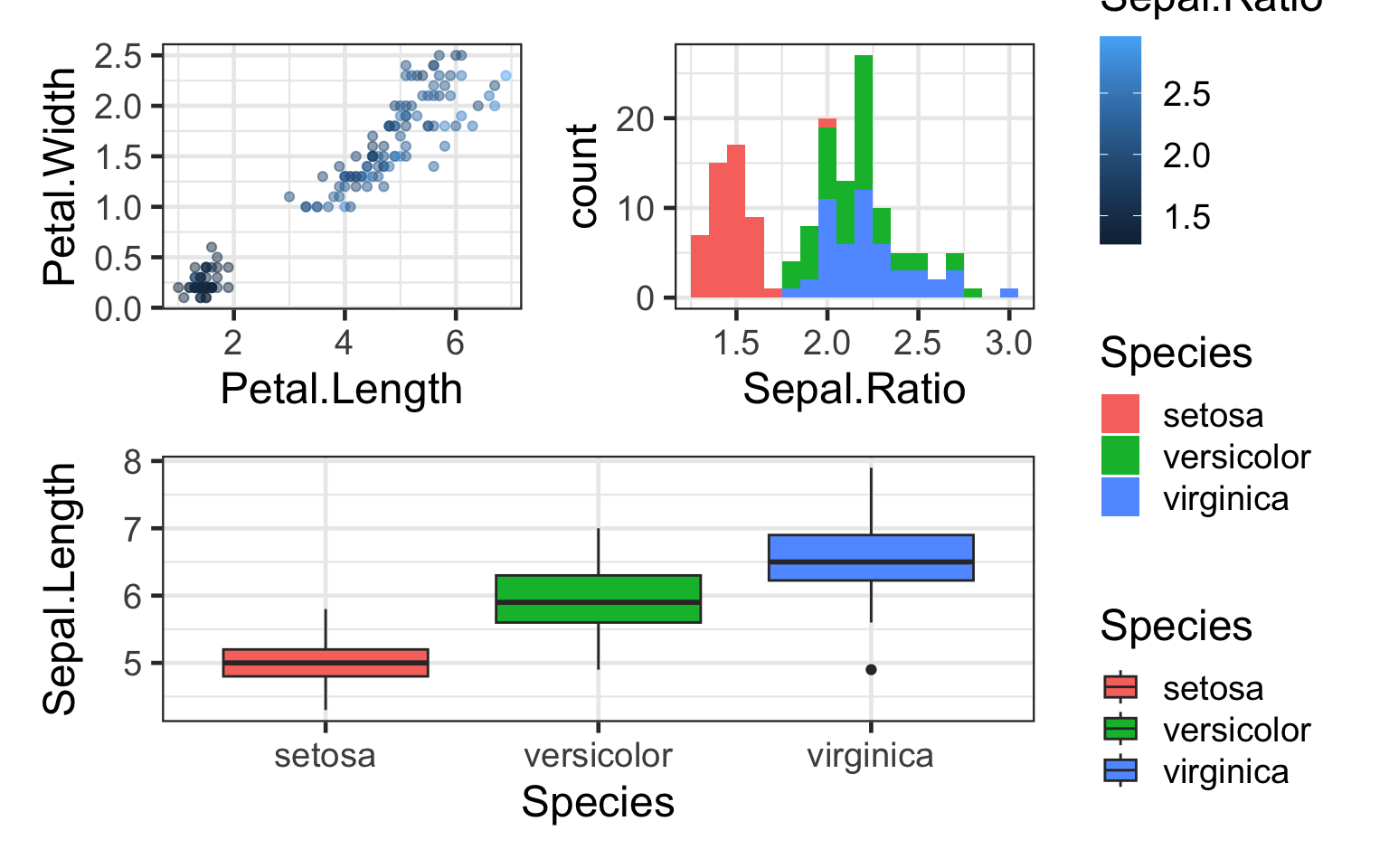
To save:
#On top
ggsave("DoublePlot.png",q/bp)
More useful functions to try
Cut functions
The cut_* functions in ggplot2 can turn continous data
into discrete levels. In this example we create a new column that puts
the data into 5 groups of equal size based on
Sepal.Length:
iris2 <- iris2 %>% mutate(Sepal.Length.Group=cut_number(Sepal.Length,5))

ggplot(iris2,aes(Sepal.Length,Sepal.Width,fill = Sepal.Length.Group)) +
  geom_violin() +
  labs(fill="Sepal length intervals", x="Sepal length",y="Sepal width")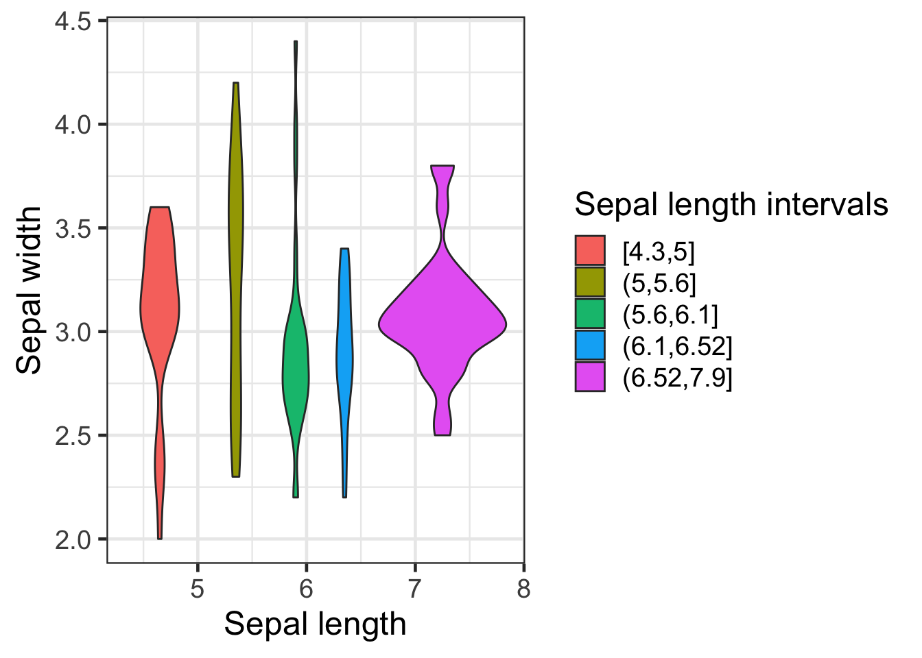
Note the use of the labs() function to change multiple
labels at once.
Have a look at the difference between the cut_number,
cut_interval and cut_width functions.
Scaling data
Let’s look at a larger dataset like the surveys_complete
data we used earlier:
ggplot(surveys,aes(weight,hindfoot_length))+geom_point()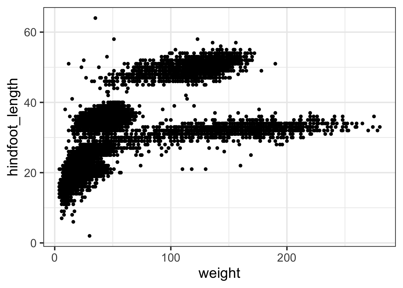
For axes with large values or very dispersed values it can be useful to rescale using a log axis. This can be done in two ways:
#We can transform the values in our ggplot call:
ggplot(surveys,aes(log10(weight),hindfoot_length))+geom_point()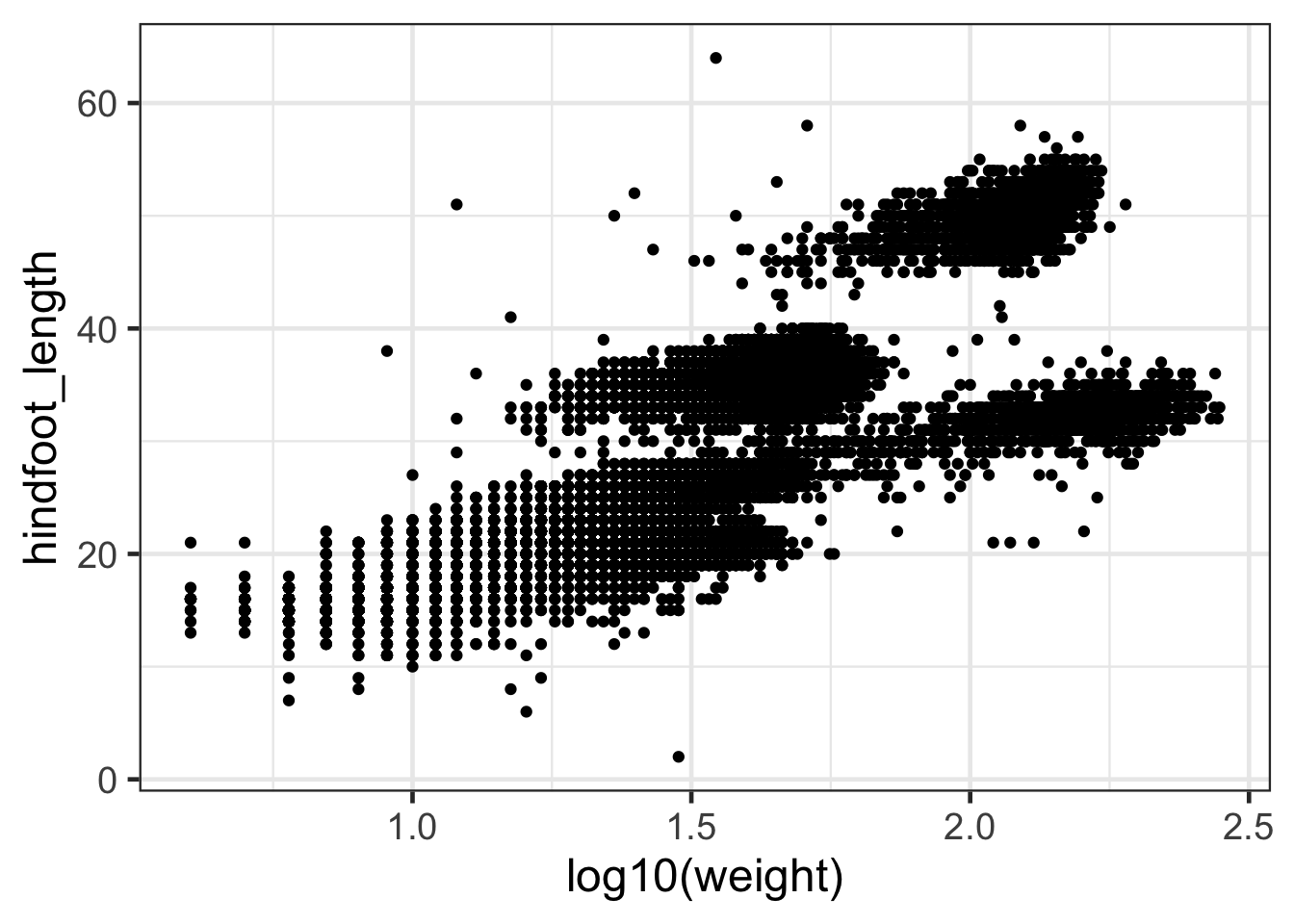
#OR we can change the axis to a log scale
ggplot(surveys,aes(weight,hindfoot_length))+geom_point() +
  scale_x_log10()
Discussion
What is the difference between these two plots?Adding labels
You can add labels to points in your graphs. One of the best ways to do this is to use the package ggrepel.
library(ggrepel)
# you can use geom_text_repel() or geom_label_repel() to label whatever you want with non-overlapping labels. In the brackets use conditional subsetting to only label the interesting elements of your data.

ggplot(iris2,aes(Petal.Width,Petal.Length,colour=Sepal.Ratio)) +
  geom_point() +
  geom_label_repel(aes(label=ifelse(Petal.Length > 6.4 ,as.character(Species),'')))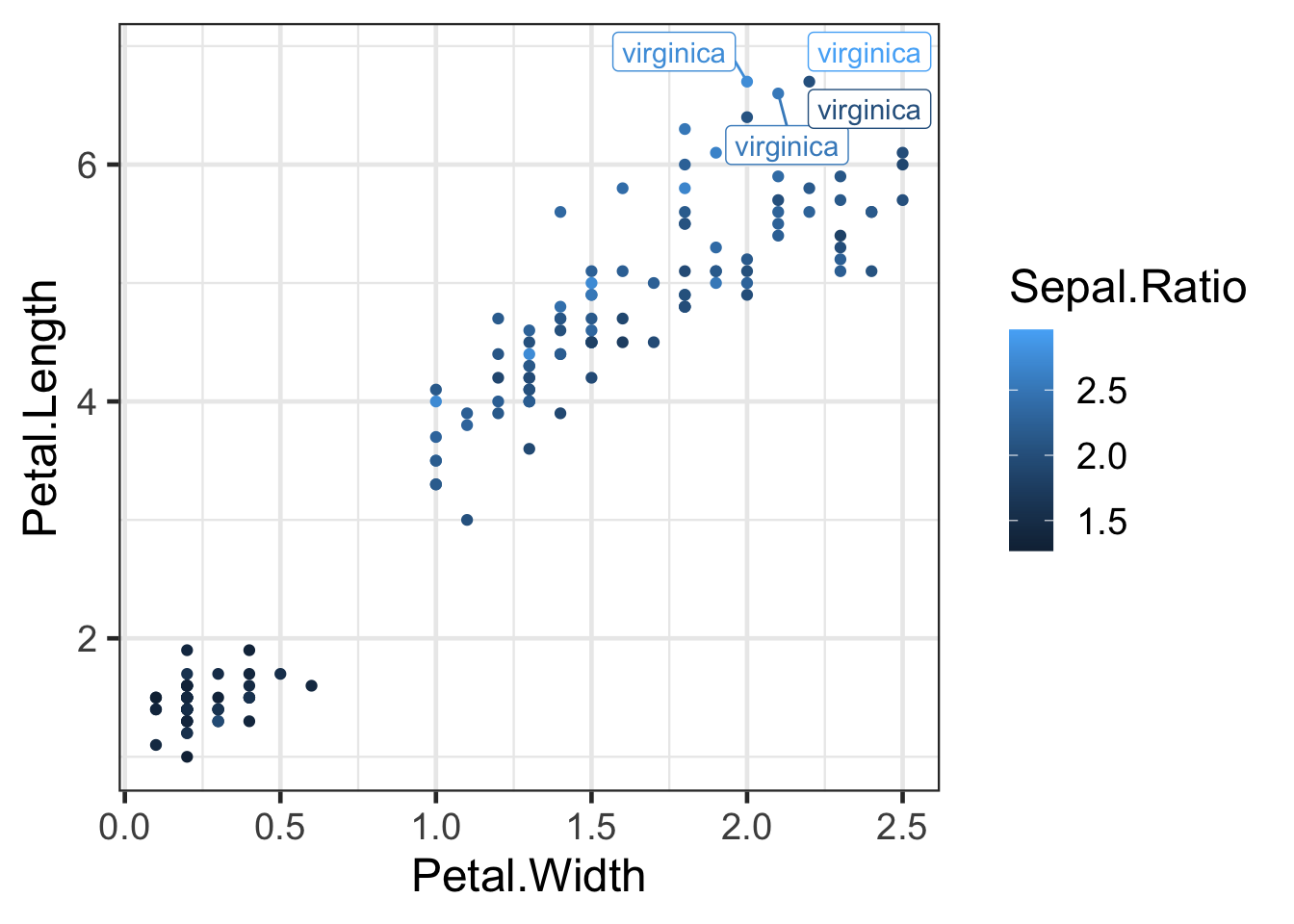
Highlight points or lines
You can choose to highlight specific points or lines using gghighlight:
library(gghighlight)
ggplot(iris2,aes(Petal.Width,Petal.Length,colour=Sepal.Ratio)) +
  geom_point() +
  gghighlight(Petal.Length > 6.4,label_key = Species)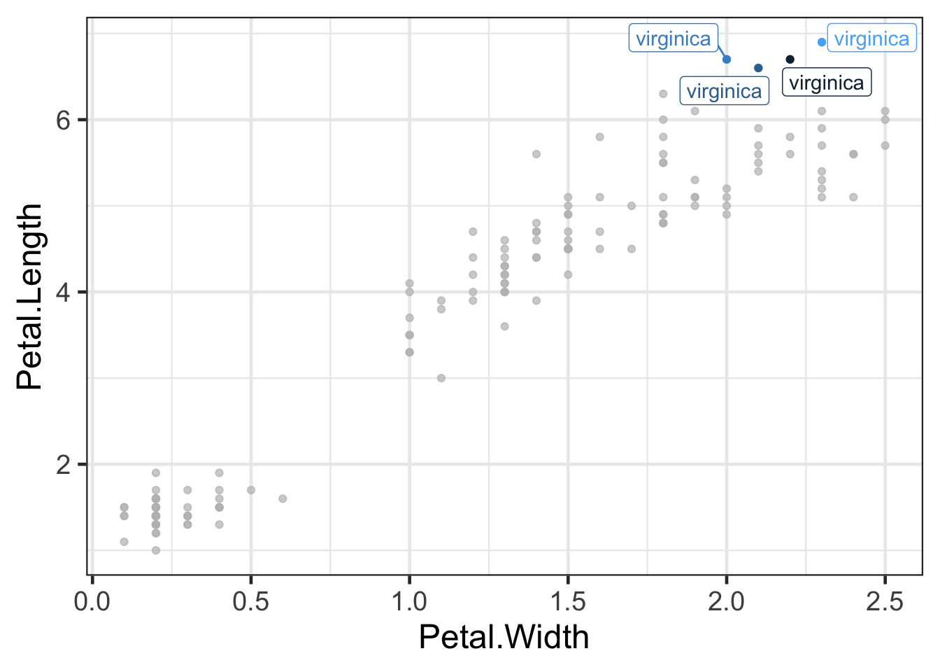
Interactive graphs with Plotly
Plotly for ggplot2 is a browser-based charting library that converts ggplots into interactive visualisations:
library(plotly)
p2<-ggplot(iris2,aes(Sepal.Length,Sepal.Width,colour=Species))+geom_point()
gp2<-ggplotly(p2)
By default the mouse over text is what is mapped in the aesthetics.
You can add a text aesthetic to add this to the tooltip
text.
p2 <- p2+ geom_point(aes(text=Country))
gp2<-ggplotly(p2)
Interactive plotly graphics open in the Viewer
pane in Rstudio and can be embedded in R Markdown
documents. Alternatively you can save them as individual web pages using
the htmlwidgets package:
#View plotly
gp2
You can save plotly objects as html web pages:
htmlwidgets::saveWidget(as_widget(gp2), "plotly_image.html")Creating detailed graphics with ggpubr
The ggpubr package provides wrapper functions for
ggplot that make it easier to generate complex, publication ready
graphics. It includes functions for running statistical tests and
displaying the results in the plot. After using ggpubr, you will need to
reset your theme with theme_set().
# Violin plots with box plots inside
data("ToothGrowth")
df <- ToothGrowth

my_comparisons <- list( c("0.5", "1"), c("1", "2"), c("0.5", "2") )

ggviolin(df, x = "dose", y = "len", fill = "dose",
         palette = c("#00AFBB", "#E7B800", "#FC4E07"),
         add = "boxplot", add.params = list(fill = "white"))+
  stat_compare_means(comparisons = my_comparisons, label = "p.signif")+ # Add significance levels
  stat_compare_means(label.y = 50)                                      # Add p-value
## [1] FALSE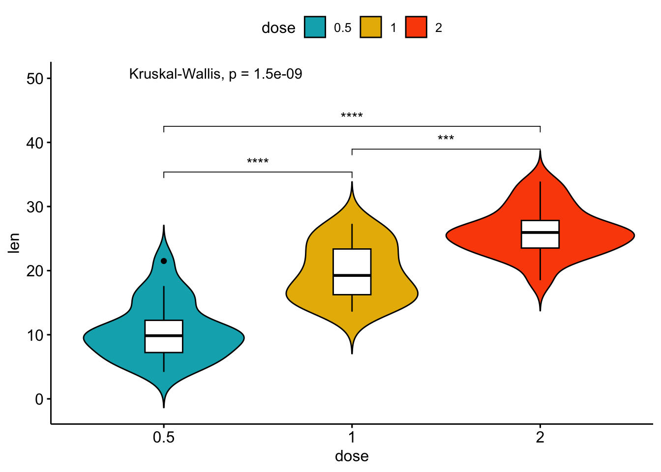
The next example additionally uses the library cowplot to add density plots within the margins of the main figure. Don’t worry if you get lost here, this is just a demonstration of what’s possible in R and beyond the scope of this course.
library(cowplot)
# Main plot
pmain <- ggplot(iris, aes(x = Sepal.Length, y = Sepal.Width, color = Species))+
  geom_point()+
  ggpubr::color_palette("jco")
# Marginal densities along x axis
xdens <- axis_canvas(pmain, axis = "x")+
  geom_density(data = iris, aes(x = Sepal.Length, fill = Species),
              alpha = 0.7, size = 0.2)+
  ggpubr::fill_palette("jco")
# Marginal densities along y axis
# Need to set coord_flip = TRUE, if you plan to use coord_flip()
ydens <- axis_canvas(pmain, axis = "y", coord_flip = TRUE)+
  geom_density(data = iris, aes(x = Sepal.Width, fill = Species),
                alpha = 0.7, size = 0.2)+
  coord_flip()+
  ggpubr::fill_palette("jco")
p1 <- insert_xaxis_grob(pmain, xdens, grid::unit(.2, "null"), position = "top")
p2<- insert_yaxis_grob(p1, ydens, grid::unit(.2, "null"), position = "right")
ggdraw(p2)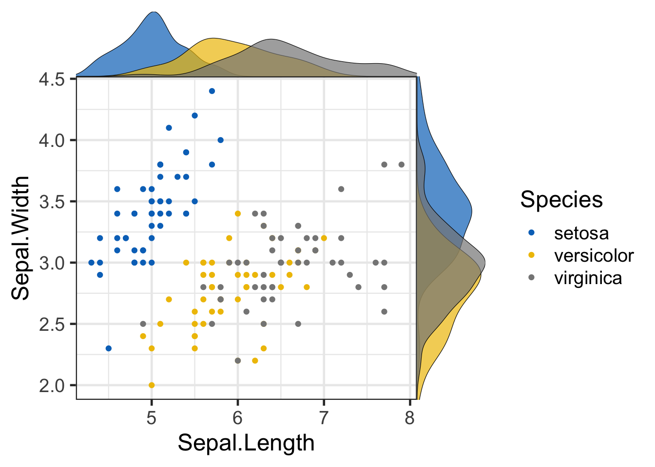
Challenge:
Spend the remaining time playing around with the different ggplot options and see if you can create an interesting and appealing visualisation with a dataset of your choice. Use the ggplot cheatsheet or the R graph gallery for inspiration!
Key points
- ggplot2 builds graphics layer upon layer
- Bind a dataset to your ggplot function and map values to visual aesthetics
- Apply different geometries to create different graphics
- Use colours, fills, gradients, shapes etc. to represent multiple variables
- Use themes to alter the appearance of a graphic
- Generate sublots with facetting
- Save your graphics with
ggsave - There are many additional libraries that extend the functionality of ggplot